Mission
Help public institutions, foundations and culture brands reach communities of color, with strategy and creative tied to measurable outcomes.
Brand System · v1.0 · Updated June 2026
One place for how The Sax Agency thinks, sounds and looks, and a working toolkit for the people who build it. Every color, token and type style below is click-to-copy.
01 · Strategic Foundation
The core idea
“We move communities of color at scale, and we PROVE it.”
Stop leading with what every agency says. Lead with the one thing only Sax can prove: major institutions trust it to reach communities of color at scale, and it ties the work to a real number.
Help public institutions, foundations and culture brands reach communities of color, with strategy and creative tied to measurable outcomes.
To prove three things at once: that strategy can be disciplined, that creativity can be culturally fluent, and that impact can be measured.
A market where reaching communities of color authentically is understood as where relevance and growth live, and where that work is measured, not assumed.
Movements, not impressions. Every engagement maps to a real result you can stand behind.
Positioning statement
For public institutions, foundations and culture brands who must reach communities of color and show results, The Sax Agency is a certified multicultural marketing agency that fuses consultancy-grade strategy with culturally fluent creative. Unlike shops competing on corporate brand budgets alone, Sax is trusted as the prime agency of record on large-scale public campaigns, and proves the outcome.
We earn cultural relevance through research and listening, never appropriation or assumption.
Consultancy-grade discipline. We make a recommendation and stand behind the outcome.
Polycultural by design. We build work that reaches communities of color at scale.
Bold creative that breaks the category template, work that lands, not work that blends in.
Every project is tied to a real number. Movements, not impressions.
Decision-makers at public institutions and government agencies, foundations, and culture brands (sport, entertainment, music, higher ed) who are obligated or motivated to reach communities of color, and accountable for measurable results.
Procurement and DEI / community-engagement leads, and the coalition of partner agencies Sax directs as prime agency of record.
02 · Messaging
Tagline
Culture Forward. Purpose Driven.
Headline promise
We move communities of color at scale, and we prove it.
Elevator pitch
The Sax Agency is a certified multicultural marketing agency in Los Angeles, trusted by public institutions and culture brands to reach communities of color at scale. We pair consultancy-grade strategy with culturally fluent creative, and tie every engagement to a measurable result.
MeansSax is trusted as the prime agency of record on large public campaigns, not a subcontractor.
ProofPrime AOR on California's ~$16M, 58-county, multilingual voter-education campaign, directing a coalition of agencies.
“When the whole state has to be reached, in 10+ languages, institutions choose Sax to lead it.”
MeansWe measure success in movement, not media impressions. Every engagement maps to a real result.
ProofWork tied to documented outcomes across sport, civic, and culture sectors.
“Movements, not impressions.”
MeansConsultancy-grade strategy and research, fused with bold, culturally fluent creative.
ProofStrategy can be disciplined and creativity can be culturally fluent, at the same time.
“The rigor of a consultancy. The instinct of a culture shop.”
MeansWe research and listen before we create, cultural fluency is built into the process, not added on.
ProofInsight and community listening lead every engagement.
“We don't guess at culture. We study it, then move it.”
03 · Verbal Identity
Confident but never arrogant. Culturally fluent but never performative. Disciplined like a consultancy, bold like a creative shop, the brand should sound like itself everywhere.
04 · Logo
#231e1c or photography.Not yet established
Full logo suite, dark-on-light wordmark, stacked lockup, standalone monogram / favicon mark, minimum-size and misuse plates, to be added. Source assets: SaxLogo_White.png, sax-logo-white.avif.
05 · Color
HEX, RGB and the CSS variable / Tailwind token for every brand color. Tap a chip and it's on your clipboard.
The signature Sax orange. Hero emphasis caps (animated), primary CTAs, links, active nav, eyebrows on dark.
The base orange. Button default fill, eyebrows on light surfaces, hairline accents. Higher contrast than Zest for text.
Near-black. Primary text on light surfaces, deepest value, button text on accent.
Muted black. Dark section backgrounds, sticky-nav tint, hero backdrop. Never pure #000.
Warm grey. Secondary / supporting text, captions, metadata.
Off-white. Light section backgrounds, surfaces, dividers between dark bands.
Text on dark, button text on Zest, clean surfaces.
Confirmations, valid form state
Caution, non-blocking notices
Errors, destructive actions
Neutral informational notices
06 · Typography
Bodoni 72
Serif. Headings & large display numbers only, weight 400. Never small labels or UI.
Inter
Sans. Body (300), and all labels / buttons / UI (600). All small text uses Inter.
07 · Layout & Spacing
| Container max-width | .sax-container, 1280px content cap | |
|---|---|---|
| Page gutter | Left/right inline padding | |
| Section padding (desktop) | .sax-section block padding | |
| Section padding (≤991px) | Tablet | |
| Section padding (≤767px) | Mobile | |
| Card radius | Image cards, surfaces (1rem) | |
| Button radius | .sax-btn (0.5rem) |
A consistent step scale for gaps and padding. Tailwind's native scale is available on Relume pages.
Clean and breathable: strong hierarchy, generous white space, clear section breaks. Vary the background rhythm (dark → white → light → dark → orange). No two pages share a section template, each page gets its own layout language. Images may bleed off the page edge when it serves the composition.
08 · Components
.sax-btnZest fill, white text, 8px radius. Brightens on hover. Main call-to-action.
.sax-btn-outlineHairline border, transparent fill. Secondary action on dark surfaces.
.on-accentOn a Zest background, buttons invert (white fill / ink text) so they never read orange-on-orange.
Hairline circular badge for any numbered-list index, 1px ink/10 stroke, serif numeral, muted. Vertical timelines add a connector line of the same stroke.
Eyebrow label
.sax-eyebrowUppercase Inter 600, Zest, 0.16em tracking. Kicker above a heading. Auto-brightens inside .on-dark.
Not yet established
Form fields, cards, navigation, modals, tabs and alert states are partially defined across the live pages but not yet consolidated here as a formal component library with documented states (default / hover / focus / disabled). To be added.
09 · Imagery & Motion
Real people and real communities of color, shown with dignity and energy, documentary over staged corporate stock. Natural light, authentic environments (civic, sport, culture). Diverse, credible, in-the-moment.
The signature image style, reserved for the full-bleed parallax bands. A single, emotion-forward close-up portrait of one subject, set against one saturated, textured color field (never a busy scene). Tight crop, high contrast, real expression, joy, intensity, presence. Editorial and poster-like; unmistakably Sax. Project work, magazine spreads, and event shots belong in galleries, not here.
Asset workflow: one branded portrait per case, tag the band image …-full-width in the client's source folder → convert to public/source/<client>/<client>-full-width.webp → set brandedPhoto on that case and drop it from the gallery. The band always renders; until a case's portrait is set it shows an interim stand-in.


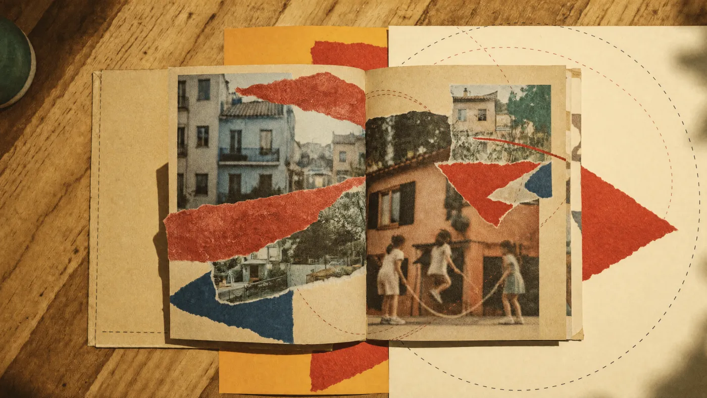
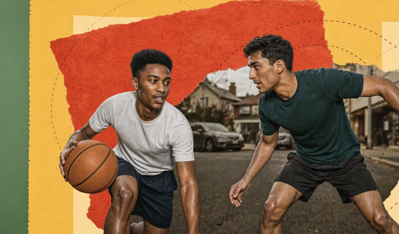
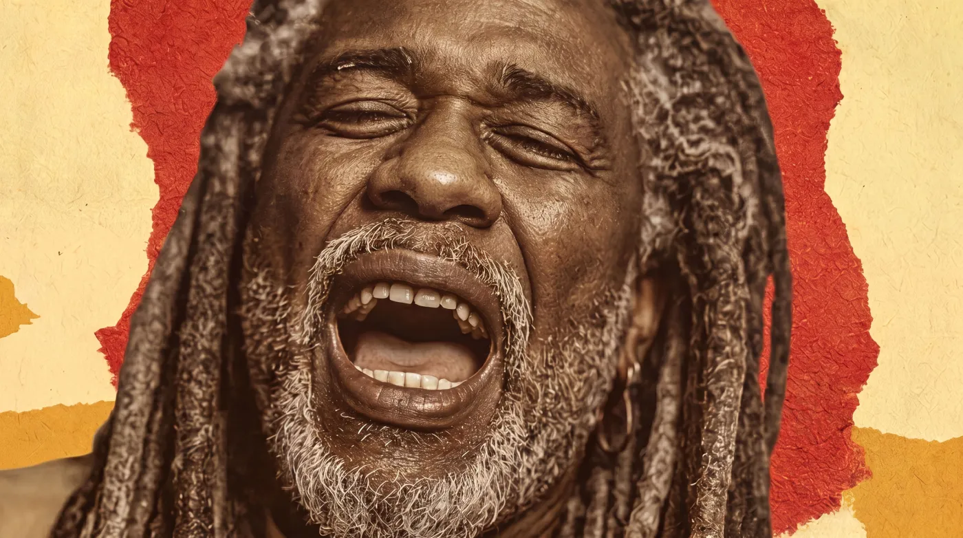
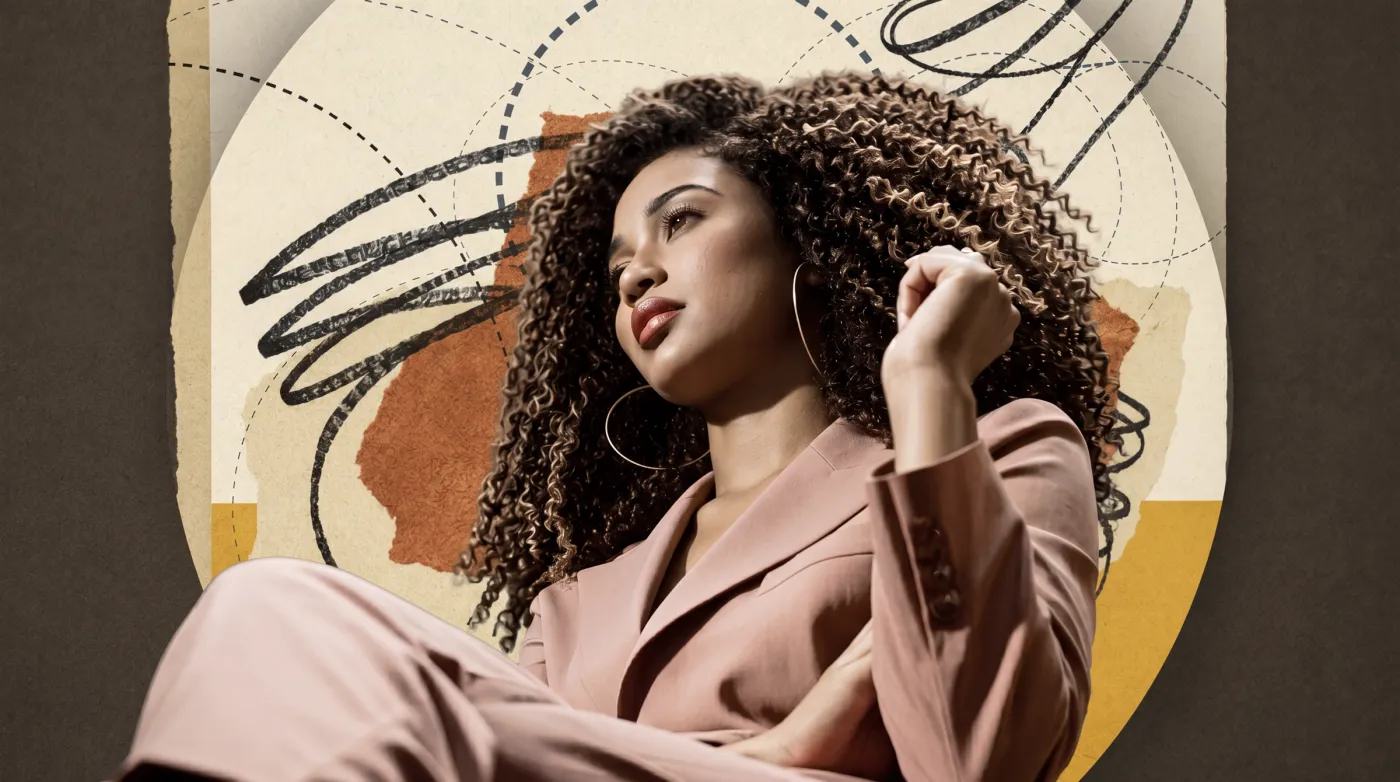
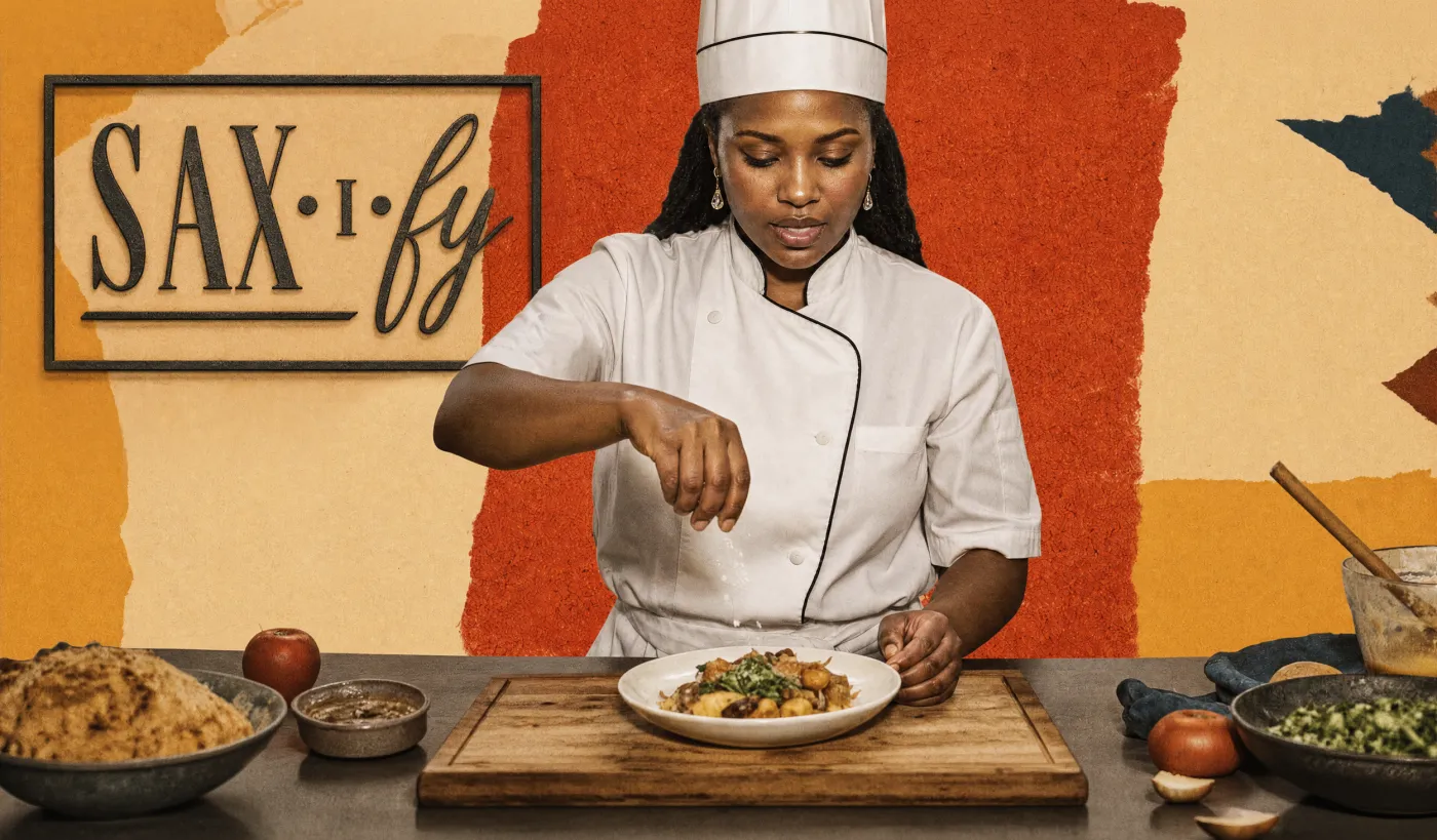

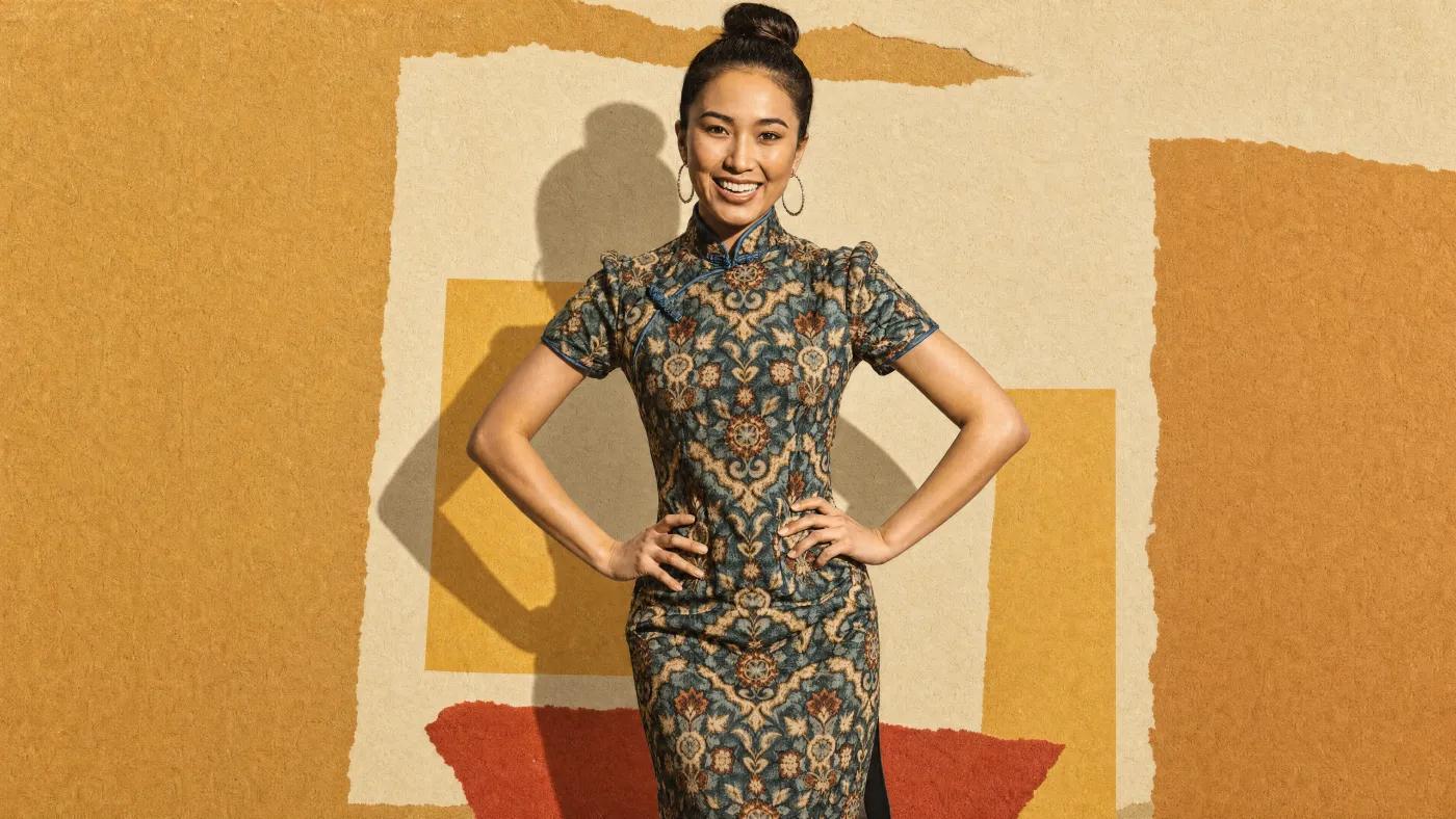
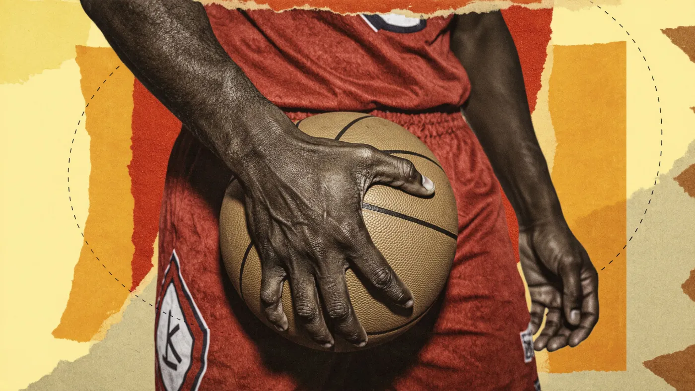
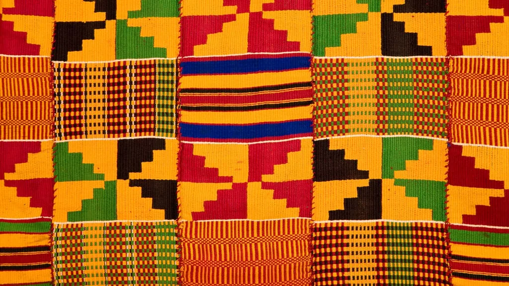
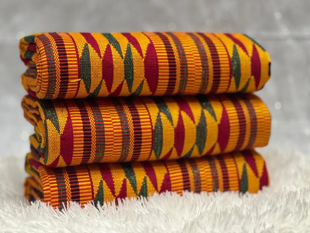
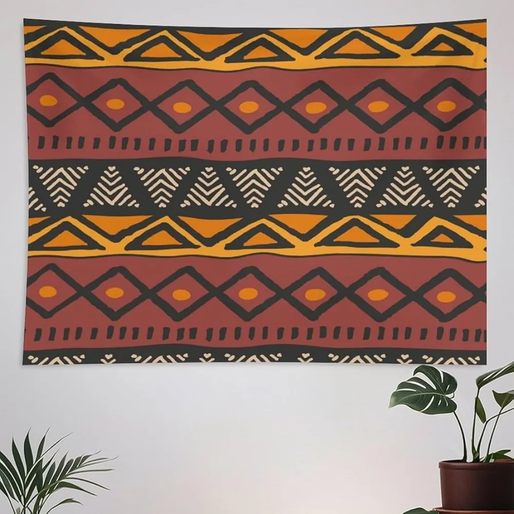
The branded imagery isn't styled for fashion, its warm, earth-toned collage palette is drawn from traditional African textiles, rooting the visual identity in the communities of color Sax exists to move. Two traditions in particular:
#231e1c).#e38033 and Zest Deep #b56628, lives in that gold/ochre family, with red and green as the supporting accents.The result reads warm, woven, and hand-made rather than corporate-cool, the color does cultural work, not just decorative work. Keep new branded imagery inside this earth-toned, textile-rooted range; don't drift to cool, desaturated, or neon palettes.
Fast, smooth, purposeful, motion reinforces hierarchy, never decorates. Standard hover / state transitions: 0.2s ease. Hero headlines: letters fade in sequentially; the orange emphasis word rises up from below, slower than the letters.
Not yet established
Iconography and illustration styles are not yet defined. To be added.
10 · Accessibility
#b56628 over Zest #e38033 when orange must carry text.alt text; decorative images use empty alt.prefers-reduced-motion where animation is significant.11 · Governance
The rules that keep the brand from drifting. When in doubt, match the home page, it's the guiding design.
A living document, last updated June 2026.